Colour psychology is the study of how colour impacts and influences our moods and behaviour as humans. Colour psychology states that colour trigger automatic emotions in us all but those emotions can vary by the context we encounter the colour in and the culture we live in.
Emotions in turn affect our actions such as our decision making and our levels of productivity. It also states that different colours have different meanings for us all. The emotions triggered by experiencing colour in turn lead to behaviours both positive and negative.
Ancient Egyptian’s Use of Colour to Heal
The ancient Egyptian studied colour and the effect on our moods and they used colours holistically in their medicines and treatments.
They believed that:
Red – Increases circulation and stimulates the body and mind.
Yellow – Purifies the body and helps the nerves.
Orange – Increases energy.
Blue – Soothes pain.
Purple – Helps with skin problems.
Black – Life and rebirth.
The Creator of Colour Psychology
Carl Jung, a Swiss psychiatrist (1875 – 1961) first studied colour as a tool for psychotherapy and developed the theories that form the basis of colour psychology that is used in marketing (especially branding theory), architecture and interior design. Jung famously said, “colours are the mother tongue of the subconscious.” His work led him to develop art therapy and he believed that our cultural perceptions to colour worked in tandem with a universal bodily response to colour.
The five main points of his study showed that:
- Colour has a specific meaning.
- That meaning can be learned, innate or biological.
- When you see a colour, you evaluate it, and it causes a behaviour.
- The influence the colour has on you is automatic.
- The meaning of the colour is affected by context.
The impact of colour
So, this means that the impact of certain colours could reasonably vary from country to country, cultural reference to culture reference across the globe. What a fascinating prospect for a company like ezoBord, working with designers and architects in workplaces across the world. Some fundamental behaviours associated with colour do seem to work regardless of country however:
Blue

The colour blue has been scientifically proved to lower heart rate, blood pressure and stress. It’s universally associated with productivity and is a popular and dependable colour when used in branding.
Yellow

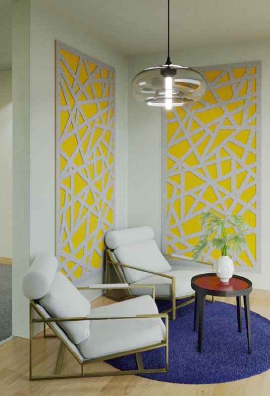
Yellow associated with welcoming – warmth, the sun and happiness, but use a too bright hue and it’s associated with hunger and frustration! Yellow has also been shown to cause eyestrain and increased annoyance in the workplace.
Red

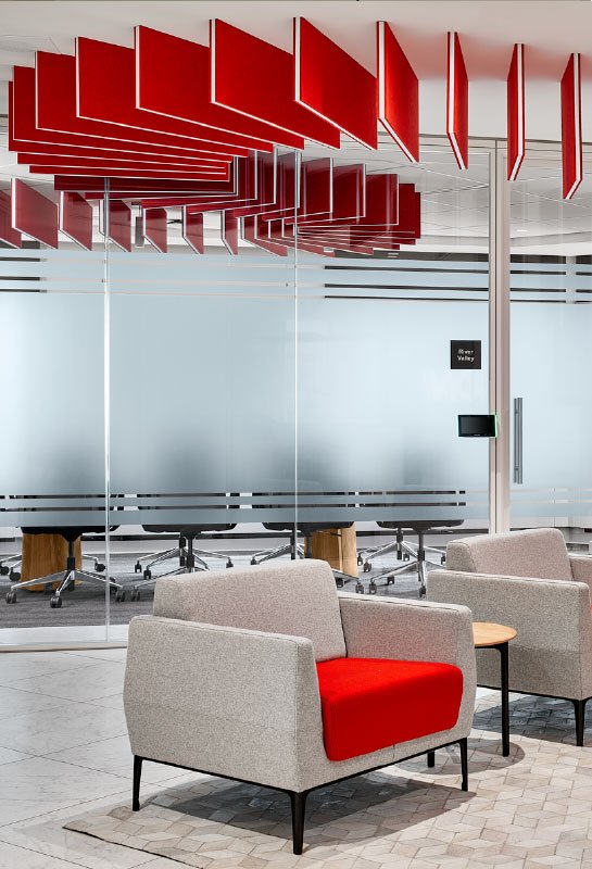
Red – the positive aspects of using red are stimulation and excitement, increasing the heart rate and brain activity. It’s the colour of love, passion and for danger. Studies have shown that employees don’t like to linger in red areas.
Pink

Seen in Western cultures as a feminine colour it gives feeling of relaxation and comfort. It is often used in spaces used for wellbeing and relaxation.
White

Clean, sterile, and ideal for specific workplaces but it can also cause eye strain particularly if combined with highly reflective surfaces.
Green

A restorative and calming colour that also implies associations of energy and youth traditionally. Olive shades of green have been shown to increase concentration levels and to aid deep levels of intense studying. It is also a colour that is restful to the eye and calming.
Monotone

Environments that rely on one neutral colour have been shown to negatively impact mood, morals, and employee productivity.
Colour in the Workplace
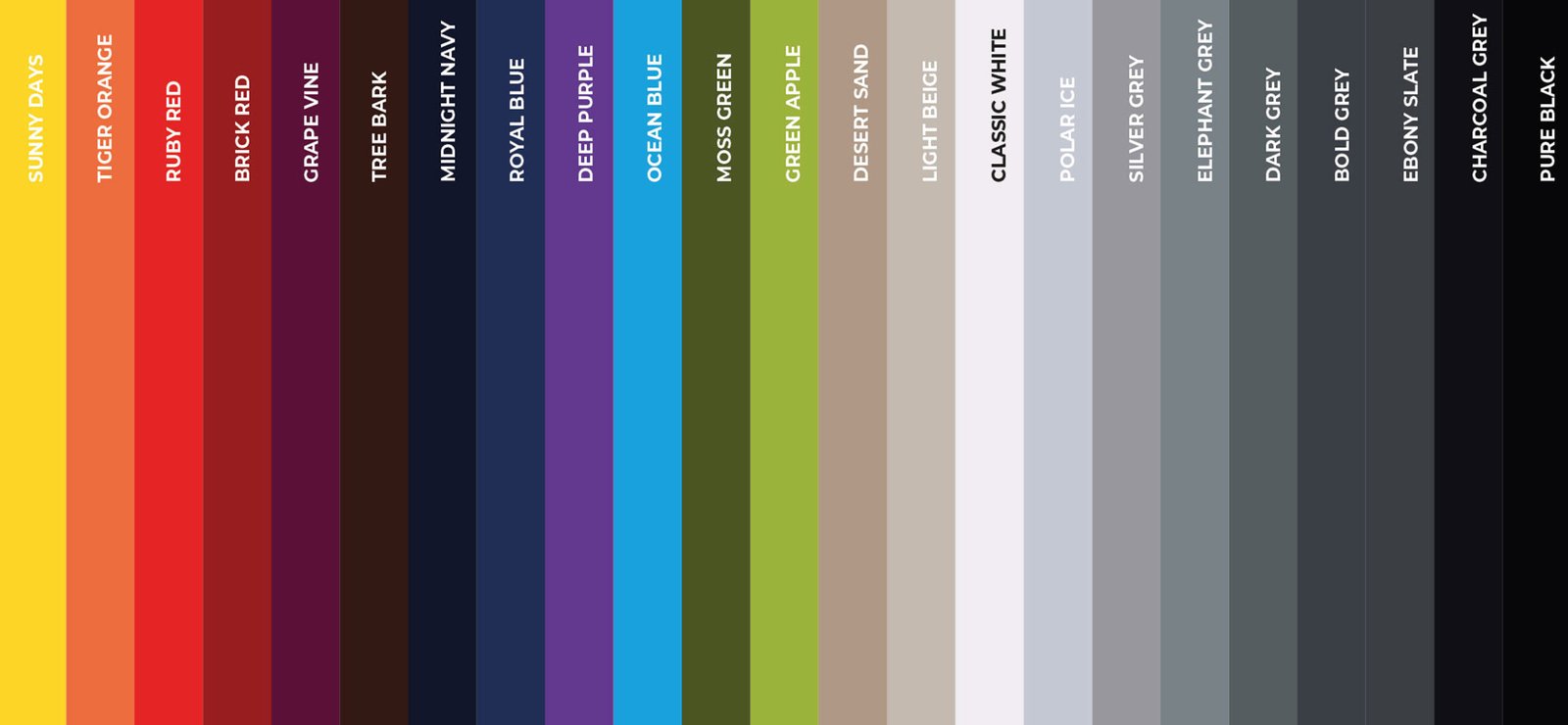
The use of colour in the workplace has a huge impact on an employees’ feelings of well-being and productivity. At ezoBord we carry a wide range of colour palettes for our beautifully designed custom acoustic solutions to suit every project and situation. You can find out more about of exclusive European and UK colour palette here or you can contact us .


